I have decided to analyse three first Hair salon websites from hull that will come up in Google after typing ‘hair salon hull‘ and look for hair salon websites world wide looking for anything new, usable and helpful that other hair salon websites might be using.
I will start with few Hair salon websites from Hull that have came up in top 5 in Google.
ORIGINALS HAIR ROOMS
http://www.originalswigsandhair.co.uk/

First things first. It is not responsive neither adaptive. Loading time of this website is pretty long, and few times I had to refresh pages, because either they didn’t load correctly or didn’t load at all.
what had most of my attention was amount and use of fonts.
Just below Navigation bar, you have few sentences here and there each one of them using either different font size or style.
Home page looks more like a blog, but with no posts added yet. Content on the website is not up to date, there is no gallery at all, neither pictures of staff working there. I expected to see more about staff and their pictures in ‘About us’ page, but I was wrong. Just a bit of text about the salon and stuff overall.
They are using Online Booking system – http://www.mylocalsalon.com.au/
However, when I click on book appointment, and it redirects me to the software, I can’t do anything, nor click anywhere to proceed.
I though that it is because their salon is closed for today, But on Facebook it says they are still open.. 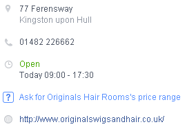
My rating – 2/5
ALEXANDER HAIR & BEAUTY
http://alexanderhairandbeauty.co.uk/
Another website not being responsive or adaptive. In my opinion there is way too many web pages (sections), some of them consist only of few sentences, some have just a picture inside, while other mix of both, but still not enough just to create separate page for it. Whole content could be organized much better.
Another big problem is drop down menus used in Navigation bar. It is quit a problems as these are not tablet-friendly, and when building responsive website it is recommended not to use drop down menus.

I have found SOMETHING NEW, that I was looking for on these websites.

Recommend a friend option, while booking online and you get discount 50%. I will have to discuss this with my Client and see what she says. I don’t know how does that work on that website as they don’t have any online booking system.
We all know that first impressions are most important ones, and in this situation this website hasn’t impressed me much. I have expected to see some form of invitation to their salon, or button to book appointment online, but no. there is just text about how talented whole staff and salon is..

What I think of this website.. there is way too much text to read, as mentioned earlier people/users/visitors prefer to see and interact rather than just TO READ. isn’t reading outdated nowadays? when it comes to websites obviously..
Overall, spending 10 minutes on this website felt like looking into someones CV. there is so many information regarding that one person named Alex and at the end it didn’t felt like hair salon website, but more of a ‘Me Alex & my salon’, where he focus most on his achievements awards, and how these influence their job etc.
My rating – 3/5
MARIE CLARE HAIR SALON & BEAUTY ROOMS
http://marieclarehair.co.uk/

Before I start talking about anything, I just don’t understand and don’t get it how come this websites comes first in Google after looking for ‘Hull Hair Salon’

I was a little bit surprised and didn’t expect to see this website being responsive. Also their booking system software which they are using is also responsive, and it was created by i-Salon.
This website doesn’t have any navigation bar, there are two buttons.. I actually don’t know if these are two separate buttons or just one, because both of these after clicking, scroll your page to section where map is and that’s all.
What does this website mainly consist of? TEXT! 
However, this text just look gross and it isn’t easy to read.
Just below all that fat text there are two links to Hair & Beauty Menus. but instead of taking you to different page. These two redirects user to PDF files. Below you can see Beauty Menu.
Below you can see these two links to PDF files, and just below these are only images found on the website.

There is no gallery, nothing about staff, not to mention no pictures of staff. One page website with big fat BOLD type.
What I liked is their booking system, or software that they are using. very easy to book an appointment, and when you are done you receive one mail with information regarding appointment, and second one with confirmation of appointment.
I will have to look more into this booking system, as it seemed to be very user friendly and easy to use.
My rating – 1/5 (if (NOT their) booking system would count towards rating, I would give maximum 2/5)
Overall, I have realized each one of these are far from being perfect. having different issues, errors and problems. None of them is using their own Appointment system, which means that either it might take long time create my own, or it is hard. Will have to research and plan something.
question of the day.. How the heck Marie Clare Website is always on top in google results? Just look at it..
