Self Initiated Project – First Design (+ 2nd Design explanation)

Based on my client feedback, all research and what I already had in my head (ideas) have quickly sketched wireframes of home page.


sketch

 Next step was to create design using this draft

1st design


Navigation bar

I wanted to minimize amount of links to minimum and I think It is better than previously.

Home – navigates to Main page.

About – I am going to write what is already on home page (from ‘Welcome to Irena…’         section) and also each individual hairdresser will be shown there (picture, personal info,     experience). Whole about page will be editable with CMS.

Services – Visitor will find out about all the services/offers available, including prices

Contact – As always contact form, with map(directions) address etc

Book now – booking appointment system


Salon image

– I am planning on some kind of auto slider gallery with images from salon. I have seen         plenty of these sliders, even responsive. so there won’t be problem with finding and           implementing one. 

– Below there is a little bit information about salon, with telephone number and ‘book now’     at the bottom.


Salon offers

Many Hair salons, have their special offers or services which might have nothing to do with standard hair services. When it comes to Irena hair salon, apart from hair services, they have:

beauty treatments including nails tips, spray tanning, waxing and more

Hair extension, which isn’t done very often and it is more of a special service taking up to
4-5 hours

Four Sunbeds ready to use at any time.

Usually customers/visitors know about standard services. However to promote other services and offers, which either people might not know about, or never seen/heard of them. I have decided to add ‘salon offers’ with these three listed above.

I still don’t know how should this section be named. Salon offers isn’t in any way appealing, and it would as well be about standard services that salon has to offer.


Footer

At the bottom there are three sections.

Salon information with address, telephone number and map of location. Opening times and Contact form.

I have decided to put these three as that’s what I have usually seen on other websites. However, i still might change location of opening times, as this kind of information should be visible immediately.


2nd Design

I have decided to do one more design so I can show them both to my client and let him decide which one she favors more or what she would like to be changed / added etc.

This time, I will be focusing more on ‘blocky’ design which is based on blocky square grid layout.  as you can see below.

http://www.regissalons.co.uk/
reggis

Square blocks used as a buttons. So it is easier to navigate on smartphones and tablets.
It is visually attractive if designed and created right.


Some websites combine square blocks images with text on any side. And again, it really looks amazing and beautiful. example below.

http://www.colour-lounge.co.uk/colorloungecouk

We can combine text with images in multiple ways when building blocky website.
Another great example, again from colour-lounge. I could ‘Salon offers’ section similar to
what you can see below.

louge


Self Initiated Project – Competitor Analysis(further research)

I have decide to do extra research on competitors. This time I have decided to go onto 11 Hairdresser websites (which I haven’t previously saw) and find out what usually hair salon websites consist of.


What I have been looking at exactly is:

Main page – what hair salon websites usually have on their home page

Navigation Bar – what their Navigation usually/mostly consist of

Text Amount – amount of text reading on home page

Colours – Mostly Grey, black and white are used nowadays in web design. So I have been looking for use of these three colours

Responsive – whether website was responsive or not

COMPTETITOR

Links to visited websites:
http://www.spirithairteam.co.uk/
http://kayapati.com/demos/milan/
http://www.cssigniter.com/preview/beaute/
http://www.kiwasalon.com/
http://www.rush.co.uk/
http://www.francescogroup.co.uk/
http://www.browns-hair.co.uk/
http://www.sallyexpress.com/
http://bleachlondon.co.uk/
http://www.nickyclarke.com/
http://davidrozman.co.uk/

Self Initiated Project – 2nd client meeting

I have met again with my client to present what I have researched and done up to this point.
Following this we had to discuss and make decision on design and content, as these are two things that I will be working on next.


ContentBased on my research and feedback we have decided to lower amount of text on website. Remove unnecessary reading and make whole content more appealing and interactive.
Just because reading big chunks of text is boring and there can be more achieved in Building websites rather than just pasting tons of text.

PART OF TEXT ON MAIN PAGE
main page text

TEXT FROM ‘ABOUT US’ PAGE
about text

Same goes to Sunbeds and Beauty salon pages, where only thing you do is reading.

I will have to plan and decide on how much reading should be on Main page. Make it useful, quick & easy to read, informative and of course good looking (using Typography)


cms

My client has decided that she would like me to create CMS for every page where text/images are going to be so everything is editable.  I asked her if she would like to have some kind of news feed on main page to write about anything  happening in salon or promotions.
Her reply was, that she doesn’t want her website to look like blog, and Facebook fan page is already working as news feed. And main thing has to be Booking appointments online. So anyone visiting website, first thing they have to find out is that Booking here is available, it is easy and quick.

Last thing was language. She definitely wants CMS to be in Polish to use it more fluently and whole website have to be in English. If there won’t be much text and I will have more time, make Polish version too.


design

Firstly I have asked client about black colour. Because as working on Discovery Phase, I have realized that different tons of orange and white are composing nicely in Design. She also agreed to it when I was presenting Personas to her. However she still wants me to try combining black into design, as it is used in her branding. But if it will look bad we will stick to white & orange version.

Apart from that, she wants to me to do rest. 2-3 different Designs, present them to her and she will pick one and I either make few changes if she still wanted or start building it.


My plan is to totally lower amount of text. So there won’t be pointless and boring reading.

Great example is sunbeds page.

sunbeds text

While at the same time you can already read about it on main page that sunbeds are available

sunbeds main

So instead of making separate page to let know visitors that they have sunbeds. With use of typography and images create something visual to let them know about it. Same goes to Beauty Salon page which Could be removed and added onto one page.

When it comes to layout I am planning on combining ‘blocky’ websites where big buttons are usually used with one page website. But main priority is how fast, easy and simple to use it will be. So depending on How much text I will write up and then sketching quick drafts of design I will have to decide which will be better option.

Self Initiated Project – Discovery Phase

I have created my Discovery Phase using Photoshop only. In order to make it more creative (design) I have been looking at creative designs of CV, Use of Infographics and Typography.

So when it comes to created personas, it took me a while to decide on what should be included in each one of them and where to put exactly each section. I have decided not to use black colour even though it is in Irena Hair & Beauty Salon Colour palette. I realized that black doesn’t fit with orange & white and asking for some feedback (regarding design) from people, gave me same answer.  I think I will have to talk about use of black colour  when I meet with client. Because personally I think (and others from feedback) website might look much better without black.

HOWEVER.. if my client agrees, and will use only orange & white for website. I will have to either use different variations of orange (which equals in researching  “designing with use of orange & white” )
OR we might both agree to try orange with use of yellow (which I have actually already used for ‘Persona overview’ TITLE and text background just below photos)

discovery phase persona overview


tomek persona


alvina


hanna hosber


moodboard

Self Initiated Project – Competitor Analysis

I have decided to analyse three first Hair salon websites from hull that will come up in Google after typing ‘hair salon hull‘ and look for  hair salon websites world wide looking for anything new, usable and helpful that other hair salon websites might be using.

I will start with few Hair salon websites from Hull that have came up in top 5 in Google.

ORIGINALS HAIR ROOMS
http://www.originalswigsandhair.co.uk/

originals hairrooms

First things first. It is not responsive neither adaptive. Loading time of this website is pretty long, and few times I had to refresh pages, because either they didn’t load correctly or didn’t load at all.

what had most of my attention was amount and use of fonts.fontsdiff

Just below Navigation bar, you have few sentences here and there each one of them using either different font size or style.

Home page looks more like a blog, but with no posts added yet. Content on the website is not up to date, there is no gallery at all, neither pictures of staff working there. I expected to see more about staff and their pictures in ‘About us’ page, but I was wrong. Just a bit of text about the salon and stuff overall.

They are using Online Booking system – http://www.mylocalsalon.com.au/
However, when I click on book appointment, and it redirects me to the software, I can’t do anything, nor click anywhere to proceed.salons offline

I though that it is because their salon is closed for today, But on Facebook it says they are still open.. open
My rating – 2/5


ALEXANDER HAIR & BEAUTY
http://alexanderhairandbeauty.co.uk/alexander pic

Another website not being responsive or adaptive. In my opinion there is way too many web pages (sections), some of them consist only of few sentences, some have just a picture inside, while other mix of both, but still not enough just to create separate page for it. Whole content could be organized much better.

Another big problem is drop down menus used in Navigation bar. It is quit a problems as these are not tablet-friendly, and when building responsive website it is recommended not to use drop down menus.
drop down

I have found SOMETHING NEW, that I was looking for on these websites.
recommend
Recommend a friend option, while booking online and you get discount 50%. I will have to discuss this with my Client and see what she says. I don’t know how does that work on that website as they don’t have any online booking system.

We all know that first impressions are most important ones, and in this situation this website hasn’t impressed me much. I have expected to see some form of invitation to their salon, or button to book appointment online, but no. there is just text about how talented whole staff and salon is..
awards winning

What I think of this website.. there is way too much text to read, as mentioned earlier people/users/visitors prefer to see and interact rather than just TO READ. isn’t reading outdated nowadays? when it comes to websites obviously..

Overall, spending 10 minutes on this website felt like looking into someones CV. there is so many information regarding that one person named Alex and at the end it didn’t felt like hair salon website, but more of a ‘Me Alex & my salon’, where he focus most on his achievements awards, and how these influence their job etc.

My rating – 3/5


MARIE CLARE HAIR SALON & BEAUTY ROOMS
http://marieclarehair.co.uk/
Marie clare

Before I start talking about anything, I just don’t understand and don’t get it how come this websites comes first in Google after looking for ‘Hull Hair Salon’

respons
I was a little bit surprised and didn’t expect to see this website being responsive. Also their booking system software which they are using is also responsive, and it was created by i-Salon.

This website doesn’t have any navigation bar, there are two buttons.. I actually don’t know if these are two separate buttons or just one, because both of these after clicking, scroll your page to section where map is and that’s all.

What does this website mainly consist of? TEXT! text hurts

However, this text just look gross and it isn’t easy to read.
Just below all that fat text there are two links to Hair & Beauty Menus. but instead of taking you to different page. These two redirects user to PDF files. Below you can see Beauty Menu.pdf

Below you can see these two links to PDF files, and just below these are only images found on the website.

hair beauty menu pics
T
here is no gallery, nothing about staff, not to mention no pictures of staff. One page website with big fat BOLD type.

What I liked is their booking system, or software that they are using. very easy to book an appointment, and when you are done you receive one mail with information regarding appointment, and second one with confirmation of appointment.

I will have to look more into this booking system, as it seemed to be very user friendly and easy to use.

My rating – 1/5 (if (NOT their) booking system would count towards rating, I would give maximum 2/5)


Overall, I have realized each one of these are far from being perfect. having different issues, errors and problems. None of them is using their own Appointment system, which means that either it might take long time create my own, or it is hard. Will have to research and plan something.

question of the day.. How the heck Marie Clare Website is always on top in google results? Just look at it..

Self Initiated Project – Client Meeting

logo

First thing that I have done was meeting with my client. Because this is all for my Project and it is Self initiated, It was my OWN idea to revamp and redesign Irena Hair & Beauty Website. I have decided to contact owner of the website and let him know about it. I have briefly explained him, why I have decided to do something with the website, and following this I have told him few ideas of mine which I could implement, including totally redesigning the website, its content and creating content management system.

Content


I  have offered two options for my client when it comes to Content. I could either leave all texts as it is, and only update missing stuff (e.g. Price List or About Us ) or let client decide on what will be written.  I have presented ideas from my research regarding content, that people are more visual, and reading pure text over and over is boring.

I have looked on the internet for ‘Web content’ and had little read about it. I have found out that there are three things that has to be followed and considered in content. Is content usable? can user interact with what is on the website? Is content useful and How easy to access it is?

We have both agreed to it, and also I have mentioned that on new website, content will be added not by me any more but client will be able to do so, using CMS.
I have still plenty of time, we have decided that we will get back to content when it comes to Designing process.

design


This is where fun bit will start, as my client doesn’t know anything about Designing, especially when it comes to  following design trends,  Actually creating design of the website and composing it all into beautifully looking website.

I have informed her about current website not being Adaptive nor Responsive (previously explaining what these two mean) and that my plan is to make it fully Responsive, so it will be easier accessible through Mobiles & Tablets. Which also automatically means, that website might look different on PC, mobile and tablet. Because she didn’t understand why is that, when she wants only one website, I have told her it will work as three different versions on different platforms.

I have explained more less about  current design trends, that flat design is dominating, big pictures, or big block buttons are also very popular among many websites. I couldn’t forget about text its own. I told my client that less text will be better, and use Typography to make it more appealing.

My client said that she wants me to fully research and  do frameworks/designs on my own, and based on these we will discuss further options (next meeting).


colours


Not much to discuss here. I knew previously that Colours will have to stay the same and I was right. My client wants me to use same colours as used on the first website. The only exception is that I can use different variations of Orange & Black. ‘White is white’ – as she said, and changing it to darker would automatically make it grey. ‘so leave white as it is’.

colours ir

But of course I won’t, that is why I have meeting with her to discuss everything and show everything that has been done, so when it comes to showing designs I will most likely play with white colour, and present it to her.

accessibility


I have explained my client that when it comes to Accessibility, website is fully accessible if all people, including disabled and elderly people, can use it. If visitor is disabled, his accessibility will depend on how his disability will affect the way he perceives information. Firstly I have informed her about what mainly affects accessibility on web.

  • People that can’t see well – colours and the contrast between colours, size of text as well as font choice.
  • People who are blind – usually these people are using screen readers. Because these can’t read images, alt tags for images and title tags for links must be used, as these will be used by screen readers.
  • People with hearing problems – Any audio or video should have included subtitles.
  • People who find mouse or keyboard hard to use – this is where simplicity has to come. Make good use of big blocks (easier to see), and make it as easy as possible to navigate through whole website.
  • People who find words difficult – lenght of paragraphs, complexity of vocabulary, choice & size of fonts. opportunity to have text read out loud.

After talking about these, I have been asked two simple questions. Will it be hard to cover these points, to make website more accessible? If not, ‘How long it could take?’

There was no answer to any of these, because I simply don’t know and that research would have to be done in order to find out. In next meeting I will have to come back to this and let client know what could be done about it.

usability


I have told my client, that usability consist of balanced design, content and accessibility and that it can’t be attained in two days. It all depends on whether website is available, clear, credible, learnable and relevant to people who actually use it .

Good usability requires complex user research and multiple user testing done. In most simple words it is all about testing, testing and testing again.

cms


Explanation was required of what CMS stands for, what is it and how does it work. I have started by explaining that current website doesn’t use content management system and adding, updating any informations is done inside file, which then has to be re-uploaded to server.
However, using different type of code (PHP) another website can be created, which will work as a little system, where all information that are on the website will be there, ready to edit, delete or add new things.
I have told that CMS allows for adding dynamically content, which takes few seconds to do, and is much safer as user(client) doesn’t work with code.
We have agreed, that every section on the website should be editable, with option of adding images, editing these,their size and more.

After talking about CMS, client only told me that CMS should be even easier than website, which automatically told me that BOTH of these will have to be VERY easy to use.

rest


I have decided to write about ONLINE Booking Appointment System here as my client is bit sceptical, and she just can’t imagine how it might work and is afraid of learning how to use it, as she already predicts that this will be even more complex than website and CMS combined together. This clearly means that I will have to either research for simple booking system, with appointment system using calendar, or research everything about using website form to send request for appointment, and these would be received on mobile phone (SMS), but then I would have to make sure that it will be possible to answer back, and send reminder of upcoming appointment. I will try my best to come up with good idea..

There was supposed to be Polish version of the website, If everything go as planned, and i will have some spare time, I will translate text to polish and make Polish version of website.

Self initiated project – Gantt chart

I went on Tom’s planner website (http://www.tomsplanner.com/) and in few quick steps created my own account.  Following this I could start creating my own Gantt chart.  However, as I was going through their website, I found that they have already created Templates for different purposes. template planner

After clicking on ‘Web Design’ template, I have been redirected to actual Gantt chart, where I already had included Phases for different tasks. such as Preparation, planning or designing.
toms planner phases
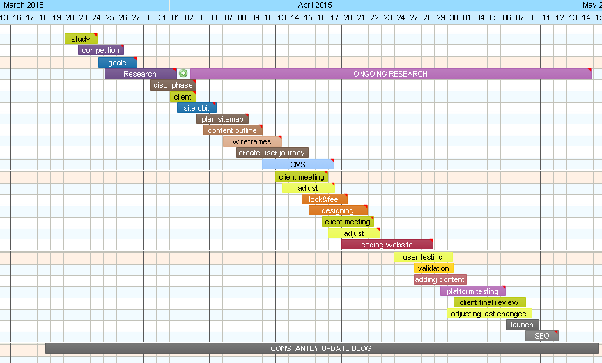
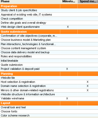
Of course list of these Phases is three times longer than what you can see above. But most of these were going too deep into details. So I have created my Gantt chart by taking ideas from the list, naming them on my own, and adding extra notes to some of them.


toms planner self initiated

This was the first time I have created my own Gantt chart. It shows clearly, on which task I should be working on and when. There are two things that are eye-catching straight away and these are two longest ‘tasks’ of ‘Constantly updated Blog’  &  ‘Ongoing research’. 

Ongoing research
I have created  phase of Research between 25th of March and 1st April. However I know from my own experience with different project, that through out whole Projects I have been continuously researching, as during project many things might change, or not go as we have planned. And sometimes it is necessary, to do extra research either to fix any issues that we have faced and can’t resolve or just to get more information or knowledge on something that we are currently working.


 Constantly updated Blog
Updating Blog on daily basis is as important as project it self. Everyday working on project, researching different things, learning new stuff or trying something new, should be immediately documented on Blog.  Reason is very simple. not updating blog and leaving it to the end will have catastrophic consequences, as project might take up to few months, and remembering everything that should be wrote about from each day is simply impossibly.
I have also been trying just to take quick notes of what I have done for certain project. Then at the end, I would write up the Blog using these notes and what I have remembered. Even though this is better than just leaving it, nothing beats Blog that is updated on daily basis.


 Some of the phases have red triangle in top right corner which indicates that there is more information written on that phase.  On picture below I have mouse over ‘content outline‘ phase and little pop up window came up with extra information that I wanted to include in this Phase.
key messages

Tom’s Planner – Online Gantt chart

No doubt, lack of planning & scheduling in any project will most likely end up with total failure. As I have been working on my projects, I used to plan more less and what has to be done and when. But most of that was only in my head – no hard copy.


toms plannerr

I have been recommended by few people to try Tom’s planner website where I can create On-line Gantt chart. Its not only 100% more efficient, but also using it is  professional.

There are some advantages of using On-line Gantt Charts. Main one  is to try and make things clearer and simpler not only for me but for the people that are taking part in project. However, when working on my SELF-initiated project, it creates picture of complexity. It helps with time management and demonstrates visually  what I am currently working on.