I have done another research. This time I was looking for on-line exhibitions (if such a thing even exist). From beginning of research I haven’t been expecting to see online exhibitions where I can walk like in game (from 1st person) and discover different parts of museums, instead just pictures and text.
I have spent most of my time on two websites, one of them is Smithsonian American art museum
I would say that, this website is using old design trends. 3 Column layout in the middle. there is lots of text and links everywhere. Instead of buttons used as a hyperlinks there is quit a bit of blue texts which are used as a links.
There is HUGE amount of content on this website, so everyone can find something for him. But I was mostly interested in these On-line exhibitions, which can be accessed from drop down menu (Exhibitions), and how these were done.
My expectations regarding on-line exhibitions have not been met and instead realistic thinking about text and pictures came true.
So when you go to on-line exhibition sections, this is what you get. List of available on-line exhibitions with a little bit of information (pic-1).
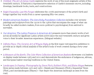 (pic-1)
 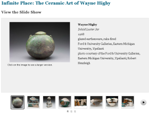 (pic-2)
Most of the time you get pictures with text on one side and all inserted into gallery (pic-2).
The Fitzwilliam Museum. This is another website that I had look at. 
Old design, two menus at the top and left side. Different sizes of fonts and colours used in fonts. Lots of useful information on museum, what’s currently on, previous exhibitions, on-line shop and much much more. But again i came here to look for on-line exhibitions.
Again I had little bit of problems with finding these on-line exhibitions but finally under On-line resources I have found it. Like in previous website you get list of exhibitions. But this list looks better in my opinion. first of all you have little pictures for each exhibition with a bit of text on side. Instead of having to click on link to see more, You have well visible ‘Find out more..’ which is much better, for people with lack of experience on how to navigate through website. And on top of that everything is nicely separated with grey line.
When it comes to checking these exhibitions, there is no specified layout/design on how each one of these is showed:
- You can get text with 1-2 pictures which after clicking on you get full size picture in new window.
- Again lots of text with 6-12 picture thumbnails which each one of these opens new html page with certain picture and text, and you have ability to click on ‘next’ and see next picture.
- Some of them contains only a bit of text with only one picture.
- There was one more when you get only pure text with three links to html galleries.
I was bit shocked that this website haven’t used any dynamic gallery as it would look much better and navigation would be also improved.
Now i have more less idea on how my exhibition might look like but still these are all fresh ideas and these are yet subject to change.


