Self Initiated Project – First Design (+ 2nd Design explanation)

Based on my client feedback, all research and what I already had in my head (ideas) have quickly sketched wireframes of home page.


sketch

 Next step was to create design using this draft

1st design


Navigation bar

I wanted to minimize amount of links to minimum and I think It is better than previously.

Home – navigates to Main page.

About – I am going to write what is already on home page (from ‘Welcome to Irena…’         section) and also each individual hairdresser will be shown there (picture, personal info,     experience). Whole about page will be editable with CMS.

Services – Visitor will find out about all the services/offers available, including prices

Contact – As always contact form, with map(directions) address etc

Book now – booking appointment system


Salon image

– I am planning on some kind of auto slider gallery with images from salon. I have seen         plenty of these sliders, even responsive. so there won’t be problem with finding and           implementing one. 

– Below there is a little bit information about salon, with telephone number and ‘book now’     at the bottom.


Salon offers

Many Hair salons, have their special offers or services which might have nothing to do with standard hair services. When it comes to Irena hair salon, apart from hair services, they have:

beauty treatments including nails tips, spray tanning, waxing and more

Hair extension, which isn’t done very often and it is more of a special service taking up to
4-5 hours

Four Sunbeds ready to use at any time.

Usually customers/visitors know about standard services. However to promote other services and offers, which either people might not know about, or never seen/heard of them. I have decided to add ‘salon offers’ with these three listed above.

I still don’t know how should this section be named. Salon offers isn’t in any way appealing, and it would as well be about standard services that salon has to offer.


Footer

At the bottom there are three sections.

Salon information with address, telephone number and map of location. Opening times and Contact form.

I have decided to put these three as that’s what I have usually seen on other websites. However, i still might change location of opening times, as this kind of information should be visible immediately.


2nd Design

I have decided to do one more design so I can show them both to my client and let him decide which one she favors more or what she would like to be changed / added etc.

This time, I will be focusing more on ‘blocky’ design which is based on blocky square grid layout.  as you can see below.

http://www.regissalons.co.uk/
reggis

Square blocks used as a buttons. So it is easier to navigate on smartphones and tablets.
It is visually attractive if designed and created right.


Some websites combine square blocks images with text on any side. And again, it really looks amazing and beautiful. example below.

http://www.colour-lounge.co.uk/colorloungecouk

We can combine text with images in multiple ways when building blocky website.
Another great example, again from colour-lounge. I could ‘Salon offers’ section similar to
what you can see below.

louge


Self Initiated Project – Competitor Analysis(further research)

I have decide to do extra research on competitors. This time I have decided to go onto 11 Hairdresser websites (which I haven’t previously saw) and find out what usually hair salon websites consist of.


What I have been looking at exactly is:

Main page – what hair salon websites usually have on their home page

Navigation Bar – what their Navigation usually/mostly consist of

Text Amount – amount of text reading on home page

Colours – Mostly Grey, black and white are used nowadays in web design. So I have been looking for use of these three colours

Responsive – whether website was responsive or not

COMPTETITOR

Links to visited websites:
http://www.spirithairteam.co.uk/
http://kayapati.com/demos/milan/
http://www.cssigniter.com/preview/beaute/
http://www.kiwasalon.com/
http://www.rush.co.uk/
http://www.francescogroup.co.uk/
http://www.browns-hair.co.uk/
http://www.sallyexpress.com/
http://bleachlondon.co.uk/
http://www.nickyclarke.com/
http://davidrozman.co.uk/

Self initiated project – Gantt chart

I went on Tom’s planner website (http://www.tomsplanner.com/) and in few quick steps created my own account.  Following this I could start creating my own Gantt chart.  However, as I was going through their website, I found that they have already created Templates for different purposes. template planner

After clicking on ‘Web Design’ template, I have been redirected to actual Gantt chart, where I already had included Phases for different tasks. such as Preparation, planning or designing.
toms planner phases
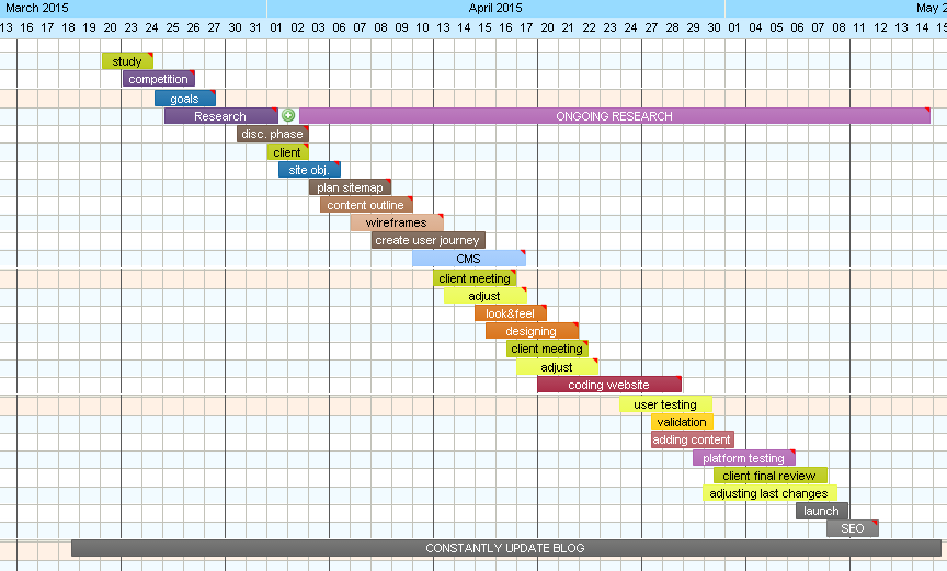
Of course list of these Phases is three times longer than what you can see above. But most of these were going too deep into details. So I have created my Gantt chart by taking ideas from the list, naming them on my own, and adding extra notes to some of them.


toms planner self initiated

This was the first time I have created my own Gantt chart. It shows clearly, on which task I should be working on and when. There are two things that are eye-catching straight away and these are two longest ‘tasks’ of ‘Constantly updated Blog’  &  ‘Ongoing research’. 

Ongoing research
I have created  phase of Research between 25th of March and 1st April. However I know from my own experience with different project, that through out whole Projects I have been continuously researching, as during project many things might change, or not go as we have planned. And sometimes it is necessary, to do extra research either to fix any issues that we have faced and can’t resolve or just to get more information or knowledge on something that we are currently working.


 Constantly updated Blog
Updating Blog on daily basis is as important as project it self. Everyday working on project, researching different things, learning new stuff or trying something new, should be immediately documented on Blog.  Reason is very simple. not updating blog and leaving it to the end will have catastrophic consequences, as project might take up to few months, and remembering everything that should be wrote about from each day is simply impossibly.
I have also been trying just to take quick notes of what I have done for certain project. Then at the end, I would write up the Blog using these notes and what I have remembered. Even though this is better than just leaving it, nothing beats Blog that is updated on daily basis.


 Some of the phases have red triangle in top right corner which indicates that there is more information written on that phase.  On picture below I have mouse over ‘content outline‘ phase and little pop up window came up with extra information that I wanted to include in this Phase.
key messages

Tom’s Planner – Online Gantt chart

No doubt, lack of planning & scheduling in any project will most likely end up with total failure. As I have been working on my projects, I used to plan more less and what has to be done and when. But most of that was only in my head – no hard copy.


toms plannerr

I have been recommended by few people to try Tom’s planner website where I can create On-line Gantt chart. Its not only 100% more efficient, but also using it is  professional.

There are some advantages of using On-line Gantt Charts. Main one  is to try and make things clearer and simpler not only for me but for the people that are taking part in project. However, when working on my SELF-initiated project, it creates picture of complexity. It helps with time management and demonstrates visually  what I am currently working on.


Self Initiated Project – Initial Idea

My initial idea is to..

totally revamp website which was built by me for Hair & Beauty Salon Irena. (www.salonirena.co.uk) and this is how it currently looks:
irnea
At the moment, it is purely static website, with no dynamic content, no PHP included neither CMS. It consist mainly of containers with texts, few pictures and YouTube video link and It isn’t neither responsive nor adaptive.


My goal Is to:

  • rebuild website, to make it more user friendly and easier to navigate.
  • Create CMS which would allow to Dynamically add content on the website, in every section.
  • Make it Fully responsive, as my target audience will be not only PC/Laptop users
  • Appointment booking system
  • Main priority – SIMPLICITY


Researching.. (+Surprise)

Like before every project, first thing that has to be done is research. Because I am creating website for 21st century museum and exhibition on four elements (air, earth, fire, water).

I have decided to start my research with searching from exhibition websites. Most of the websites that showed up had usually information on their current and previous exhibitions. Their design usually consisted of 3 column layout  due to lots of text and most of them are still using old designs. Often these websites are using two menus, one on top and one on the left side.

First website that I had look at (2 days ago)  was:  Tower Bridge Exhibition website  and this is how it has looked.tower bridge exhibition

.3 column layout. With all information that you need either on exhibitions or bridge history or even its lift times. When it comes to design we can easily say that it is a bit ‘old school’.

Today I have decided to re-visit this website again and I simply couldn’t believe. It took me few minutes to realize  that I am not on wrong page,  its just their design that has changed drastically.

tower bridge exhibition new

You can smell that creator of this website knows design trends. Big picture used as a background, minimal amount of text and big buttons.

On previous design exhibitions section could be accessed through menu on top. When it comes to new design it took me a bit of time to realize that in order to access exhibitions I need to scroll down a bit and there was link to exhibitions.

towerbrdige ss

First Idea for Project

Basically what i would like to create is a story line seperate for kids and adults. so at the beginning of tour you would choose on app if you are kid or adult (choice of male/female & boy/girl – to be considered).

Each one of these would be given a certain task. for example if you were a boy or girl, you would have list given by your mom to go to x shop and buy x items, see price of certain product etc etc. (for kids it would be more of a game). If you have picked adult, then it might be something similar but a bit complex. (these are just fresh ideas, and through out whole process it might be changed)

After picking your character of adult or kid, you would be welcomed to the streetlife.
I have decided to focus on the whole area of streetlife museum where shops are on the road, plane cars etc. (thats why i would call my project streetlife)
After starting the app you would hear sounds of cars, planes, people talking, etc from back in time. (on earphones) whenever entering the shops you would hear owner talking to you if he might help you in something, sound of other customers talking etc.

when entering shop, system will auto-remember which shop you went to in order to make quiz at the end and maybe for some more content. (to be considered..)

before entering any shop you get message on tablet “you are about to enter xx shop..” and with a little bit of story/history of the shop.

While walking round the museum, i would let visitors to use scan function, which allows them to point tablet on certain object and get extra information the tablet and maybe scanned object in 3d so they could move it around or video with it being used. (to be considered..)

I need to remember about augmented reality, audio tours as these two might be really useful. Or maybe apart from audio tours add sounds of streetlife to give visitors better experience.

When creating for kids i need to remember about:
-simplicity
-ease of use
-more pictures/audio and less text
-less complex quizz
-mini-games?